Template teardown: a back-in-stock band driven by a custom label
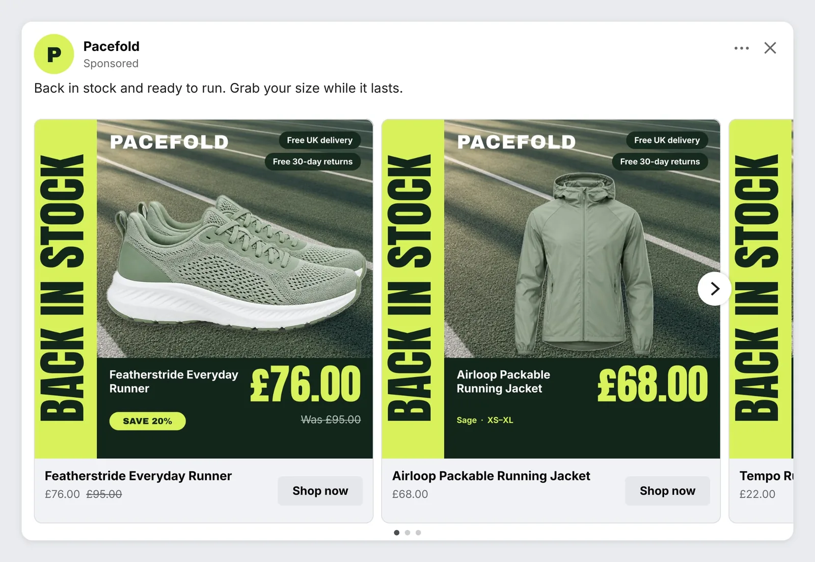
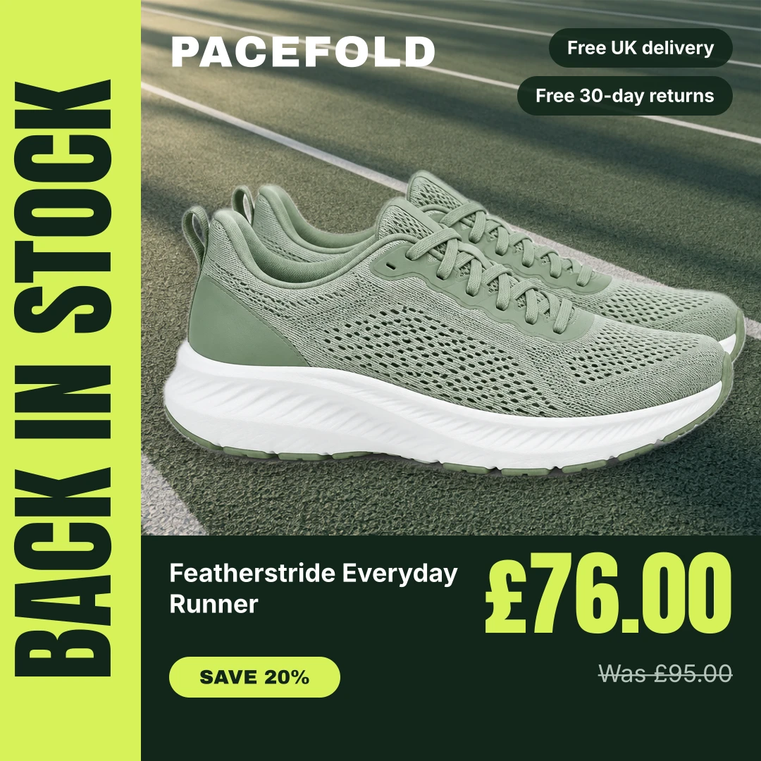
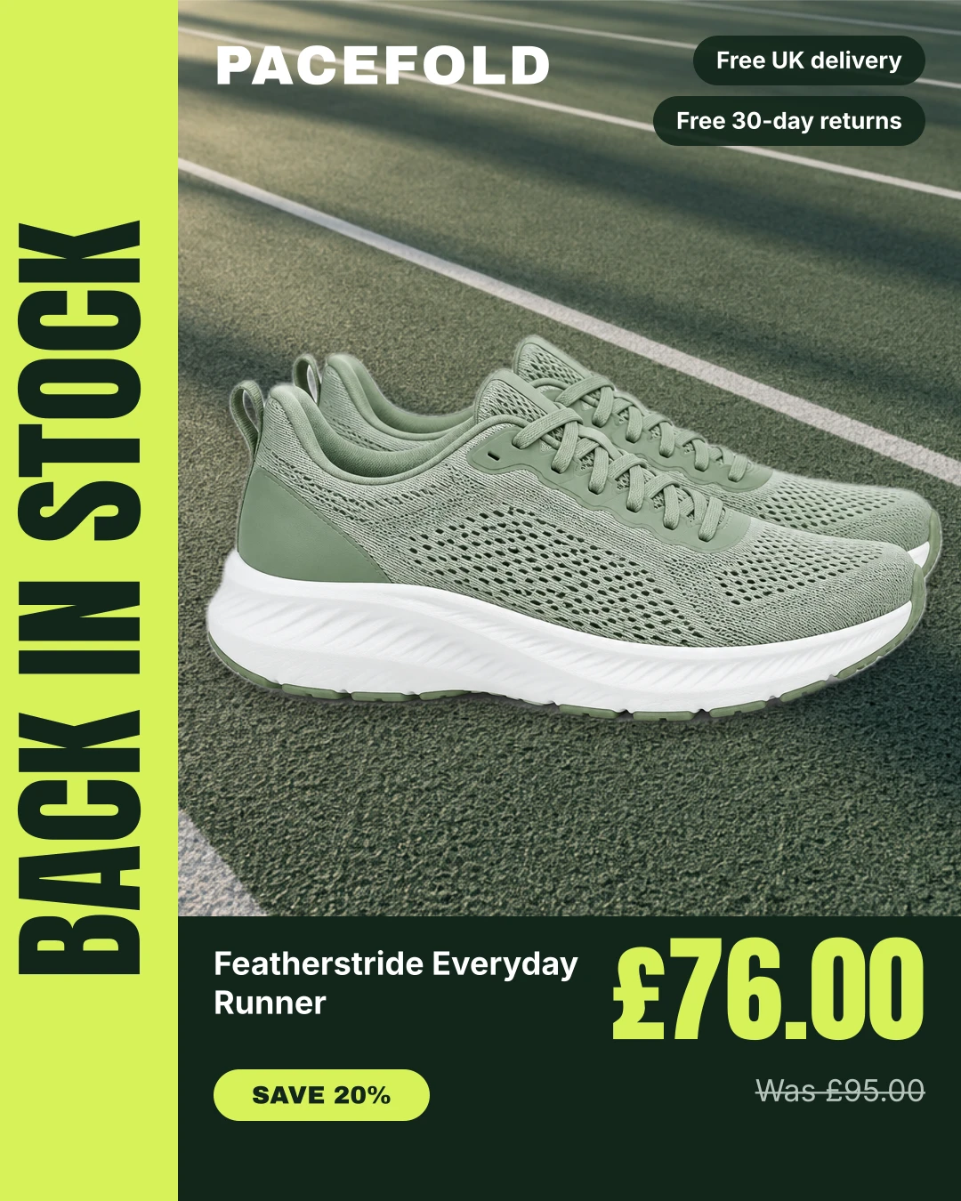
An invented running brand's catalogue ad with a vertical BACK IN STOCK band that comes from the feed, a cut-out product on a track photo and a large price.
AI Shopping Feeds 3 min read
Concept, not a real ad. The brand, products and offers here are invented, and the product photos and backgrounds are AI-generated. Each card was rendered by our DPA Creative Editor from the product's feed data, with nothing edited afterwards; the feed post around it is a neutral mock-up. No real brand ran this ad or is connected with it.
On this page · 4 sections
Template Teardown takes one catalogue ad design made in our DPA Creative Editor and pulls it apart: what each part does, which parts come from the product feed, and what you’d change for your own brand. Every example is a concept for an invented brand. The cards are straight output from our renderer, using each product’s feed data, with nothing edited afterwards.
This time: Pacefold, an invented activewear brand, and three restocked products: the Featherstride Everyday Runner (on sale at £76.00, down from £95.00), the Airloop Packable Running Jacket (£68.00) and the Tempo Running Cap (£22.00).
What the design does
The design has one job: tell people who missed out that the thing they wanted is back.
- A vertical band down the left edge says BACK IN STOCK in tall condensed type. It reads at a glance and repeats from card to card, so a carousel looks like one ad rather than three.
- The product is cut out and placed on a running-track photo. The background removal does the work: the trainer, the jacket and the cap all came from plain packshots.
- The price is the biggest thing on the card after the band, in lime on a near-black panel.
- Two delivery and returns chips sit top right, level with the wordmark, where they don’t compete with the product.
What comes from the feed
| Part of the design | Where it comes from |
|---|---|
| BACK IN STOCK band | {{custom_label_0|upper}} |
| Wordmark | {{brand|upper}} |
| Product name | {{title}} |
| Price | {{price}}, or {{sale_price}} when there is one |
| Was price and SAVE pill | {{price}} and {{discount_pct}}, only when on sale |
| Colour and size line | {{color}} and {{size}}, only at full price |
| Delivery and returns chips | Typed text, the same on every card |
The band is the clever part. It isn’t typed into the design: it’s the product’s custom_label_0. In this feed, restocked products carry the label “Back in stock”. A second, hidden layer shows the brand name in the same place when custom_label_0 is empty, so a product without the label still gets a finished card.
That means one design covers every product. Set the label on restocked items, with a feed rule or in your source data, and those cards say BACK IN STOCK. Clear it, and they go back to the brand name on the next render.
The lower panel also changes with the price. The runner is on sale, so it shows a SAVE 20% pill and the old price struck through. The jacket and cap are full price, so the same space shows their colour and sizes instead. Nothing is left empty.
What we’d change for a real brand
- Keep the label short. “Back in stock” fits the band. “Back in stock in all sizes” won’t. Set the text layer to shrink to fit, or agree a short list of label values.
- Decide when the label comes off. A product that has been “back in stock” for two months isn’t news. Clear the label once the restock is old, so the band stays honest.
- Use the band for other moments. The same layer works for “New colour”, “Last few” or “Bestseller” if those are the values your feed carries.
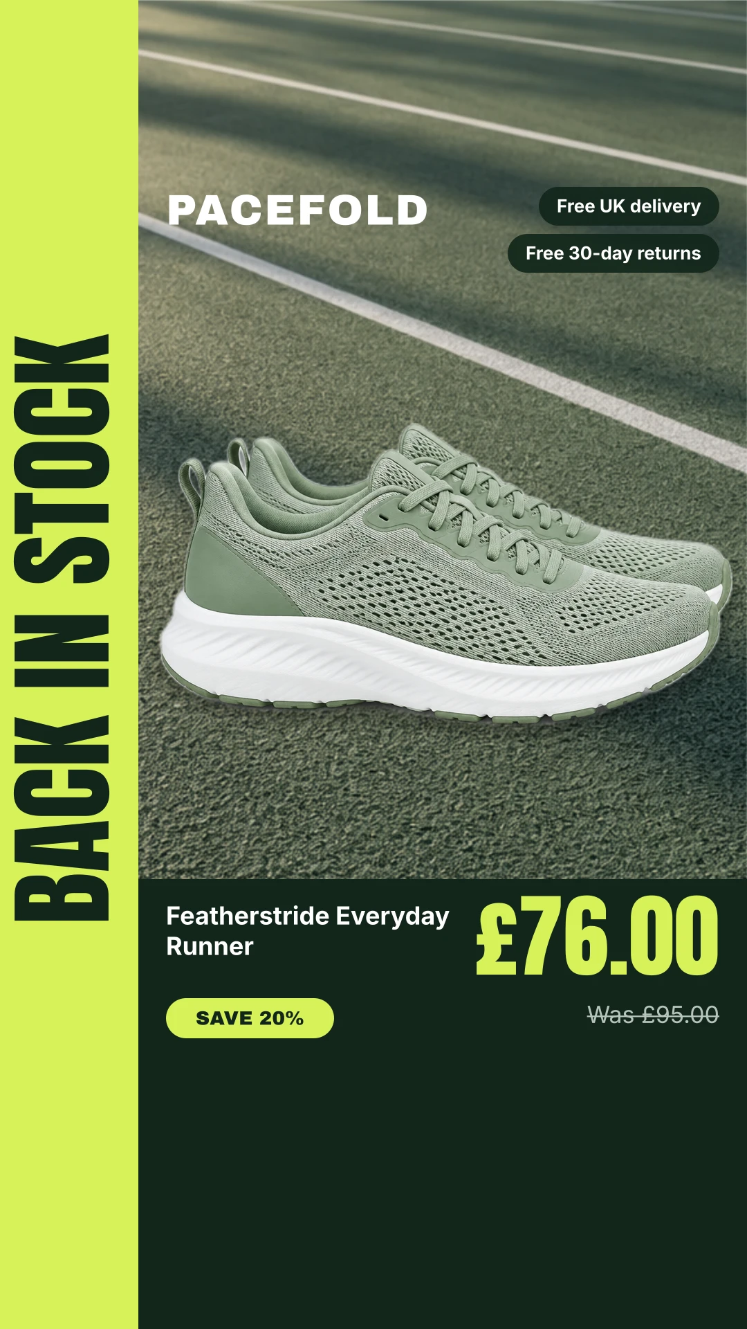
- Mind the story placement. In the 9:16 version, keep the price and name clear of the very bottom of the screen, where Stories and Reels put their own buttons and captions.
Build it yourself
Everything in this design is a standard editor layer: an uploaded image for the background, shapes, text with placeholders, and the product image with Remove background switched on. Background removal is free for the first 50 product photos in each feed, then 1 AI credit per photo. Save your colours, fonts and logo in the brand kit so they’re to hand in every design, preview the result on products from your own feed, and publish. Every product then gets its own version, re-rendered when its price or details change. For the main kinds of layout and when to use each, read DPA templates: catalogue ad layouts and when to use each.
Keep reading
More in Template teardown Seasonal Christmas delivery cut-off dates in catalogue ads 28 October 2026 · 4 min read
 Seasonal Cyber Monday catalogue ads: switching sale creative without rebuilding your ads 27 October 2026 · 4 min read
 Catalogue creative Google Shopping image rules: why your catalogue ad designs can't go there 27 October 2026 · 3 min read